Working with Neutrals

Today’s post was written by Indigo, a long time Unicorn from our Maryland Shoppe, with edits by Erica.

As promised, welcome to our post on working with neutral colors!

In a world of glitz and glam, neutral colors may seem like background noise.  But these soothing, subtle, sophisticated colors are nothing to ignore. Use them independently, or use them as a base to guide and enhance bold accent colors.  The right neutral can change the entire mood of a palette. 

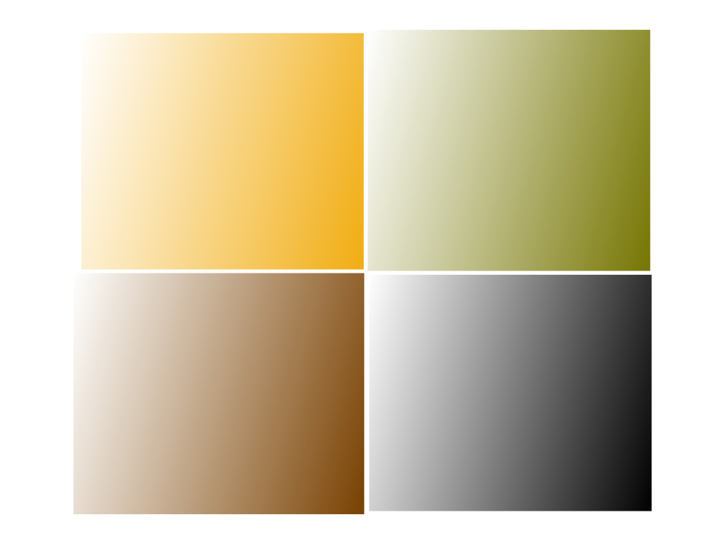
So what are neutral colors anyway? Neutrals are inspired by nature. But unlike earth tones which can be bold like fire and vivid like the setting sun, neutrals are softer. They are soothing, gentle, and lacking in the intensity of earth tones. Neutral colors range the spectrum of natural colors, from the palest tints to darkest shades.  For our purposes, natural colors mean creams, browns, yellows, greens and greys. We include white and black in our neutral selections, though technically they’re their own beast.  Not all yellows and greens are neutrals. Yellows leaning towards brown, like mustard and ochre, could be considered neutrals; while sunshine yellow is not.  Greens tending towards grey, like olive or oak moss could be considered neutrals, while emerald green is not.  Colors that lack sharp visual contrast are more likely to be neutrals.

Historically, neutral colors were the easiest to replicate, so they were the first dyes discovered and used. Eventually folks became better at replicating bolder colors, and our clothing became brighter and more vibrant.  Though, as you’d expect, those bold colors came with a high price tag, so neutrals became the domain of less wealthy folks, whereas the bright bold colors (especially purple, red, and blue) were the domain of the nobility and the elite. If you’re trying to create a simple peasant-style outfit, stick to neutrals! 

By the Victorian Era dark neutrals like black, charcoal, olive and navy became the popular color choices.  Several generations later, during the time spanning both World Wars, neutrals had again gained popularity.  For most of history, really, neutrals gained prominence during times of war, restraint, and rationing. In times of peace, plenty, and excess, bright rich colors led the way. In recent times, the choice of neutrals most often reflects modern minimalism, sophistication, and clean simplicity.  

Now let’s take a look at how you can use neutrals in your garb and costuming today. 

Like all colors, neutrals fall into two categories: cool colors and warm colors. Cool colors have blue and purple hues.  Warm colors have red, orange, and yellow hues. Green is the tie-breaker color, and can be cool or warm depending on whether it is more blue leaning or yellow leaning. Cool neutrals are colors like grey and black. Warm neutrals are colors like cream and brown. For a harmonizing look, combine cool neutrals with cool colors and warm neutrals with warm colors. For a more contrasting pop, combine a cool neutral with a warm color or a warm neutral with a cool color. The great thing about neutrals is that they can be paired with just about anything without clashing.  

It used to be written in stone that brown and black simply did not mix, nor did cream and white. That is less strictly followed now. And don’t forget- as far as we’re concerned if you do it with Intention and Joy, you’re doing it right! So mix those colors! 

Hopefully you understand neutral colors in fashion better now. We’ll wrap things up with some tips for using neutrals in your next Unicorn Clothing ensemble: 

  • Lighten an outfit up with a cream or white blouse. Lighter neutrals lift and accentuate all the colors of an outfit. 
  • Similarly, you can darken an outfit by using a black blouse.
  • If you’ve picked a bodice or belt with some neutral colors in it, try to match those neutrals in the skirts. 
  • Use black as the bottom skirt to ground an outfit and divert attention away from the bottom. 
  • In general we structure our outfits from lightest color to darkest, from top to bottom, to flatter the wearer. 
  • If you’re unsure of what colors you’d like to pursue, or you’re looking for some simple separates that will mix-and-match well with a variety of other pieces…start with neutrals! 
  • Steampunk style is basically Victorian Era garb in predominantly creams and browns. 

Prefer to listen rather than read? Find our Podcast Mane Street Chronicles on Spotify and enjoy our articles audibly instead!

Choosing Colors for Your Ensemble

Today’s post was written by Indigo, a long time Unicorn from our Maryland Shoppe, with edits by Erica.

I love colors. I love working with color, and exploring the different ways colors can be combined. I love all the variety of colors we supply at Unicorn Clothing. Sometimes all those choices can be overwhelming though! The largest part of my job is usually instructing customers on color theory and suggesting color combinations. This is also my favorite part of my job, because I like to think I have a good eye for what fabrics we have available, and how those colors can be worked into outfits. For example, sometimes we don’t have forest green, but a sage would be a nice addition in place of it!

Before we explore more ways to work with colors when picking out your next Unicorn Clothing ensemble, lets review some basic color theory. We all remember the color wheel from elementary art class. It focuses on the three primary hues of blue, yellow, and red. Between those, you have the secondary hues; green, orange and purple. Does it make sense how blue and yellow make green, so green is between those two? Excellent. 

You may have noticed we switched to the word “hue” instead of “color.” Let me introduce our first new color word. Color is a very general word used to mean any visible point on the light spectrum. Burgundy, red, pink, yellow, mustard…they’re all colors. For our purposes here, we will use hue to mean the specific color family the color is based in, and it is one of the six primary and secondary colors. So those are our six basic hues. We’ll introduce some more color words later on, but that’s a good place to start.

If you look at the color wheel we have, you’ll notice that red is opposite of green, blue is opposite of orange, and yellow is opposite of purple. These color matches are known as Complementary Colors. They go together nicely because they don’t have any hues in common. When selecting colors for your outfit, one palette you could use is the complementary palette (a palette is a range of colors used by an artist.) For example, if you like yellow, you can pair that with purple for a bold complementary outfit.

Another possible palette is the analogous palette. This means taking colors that are next to each other on the color wheel. For example, if blue is your main color, you can add green and/or purple because they fall next to each other. These are fun if you want to focus on a season or an element for an outfit idea. For example red, orange, and yellow are suitable for an autumn or fire theme. Blue, green, and purple, suggest a water theme.

Another idea is to pull from the monochromatic color palette. This is when you focus on many different tints, tones, or shades of one color. This is a great way to create a look if you have a favorite color or a color you know looks good on you!

Whoa! Whoa! Whoa! What are all those color words I just dropped there? Tints are variations of a color with only white added. They make for lighter paler colors, like pastels. Tones are variations of a color with only grey added. They make for dulled, complex, sophisticated colors. Shades are variations of a color with only black added. They make for darker richer colors.

Tints, tones, and shades help you define the mood or personality of your outfit. Unadulterated hues are often viewed as childlike for their bright boldness. Heavily tinted pastel colors are often used in the spring and for youthful outfits. Heavily toned colors are considered complex and pleasing to the eye. They are often used in modern color palettes. Heavily shaded colors can be used to create darkened outfits that can either feel sinister, or elegant and romantic.

As a side note, all black fabric is actually just an extremely dark shade of one of the basic hues. It has not yet been possible to create a true black fabric dye. So even in creating an all black ensemble, the basic rules of color theory must be followed! Is it a red hued black? Or a blue hued black? True color connoisseurs will know!

That’s enough color theory to get you started. Once you know what colors you like, and what mood or theme you’d like to emulate, it’s time to start playing with combinations! If you’ve noticed…pretty much anything goes as long as you like it, you do it with intention, and you’re confident about your choices. We love colors, remember! We can make anything work.

But wait! What about neutrals, you may be thinking? And how do I know what will look good on me? We’ll explore those topics in future posts. For now, have fun enjoying the color spectrum with us!

Prefer to listen rather than read? Find our Podcast Mane Street Chronicles on Spotify and enjoy our articles audibly instead!